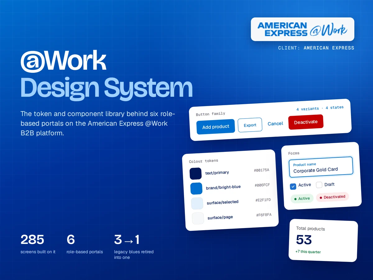
Every team has its own button
Duplicated components slow design reviews and confuse users.
What I doEvery duplicate and inconsistency found, with a plan to merge them.
Hover or tap a card to see how I fix it. Most projects start with one of these.
Duplicated components slow design reviews and confuse users.
Hard-coded colors and directions turn every new theme into a rebuild.
Figma says one thing, production does another.
Tokens let the same component adapt to theme, language direction and density without redesigning it. Try the switches.
Spend limit SAR 50,000. Next statement on 1 Nov.
Tokens: surface, text, accent, accent soft
Design systems from first audit to developer handoff. Pick one to see an example from real work.
A clear plan from day one. You always know what's next and what it costs.
We talk through your product, users and goals. You get a clear scope, timeline and price.
Journeys and structure first, so we agree on how it works before how it looks.
High-fidelity screens and a clickable prototype, refined with your feedback and real users.
Specs and components for your developers, or build and launch with my studio.
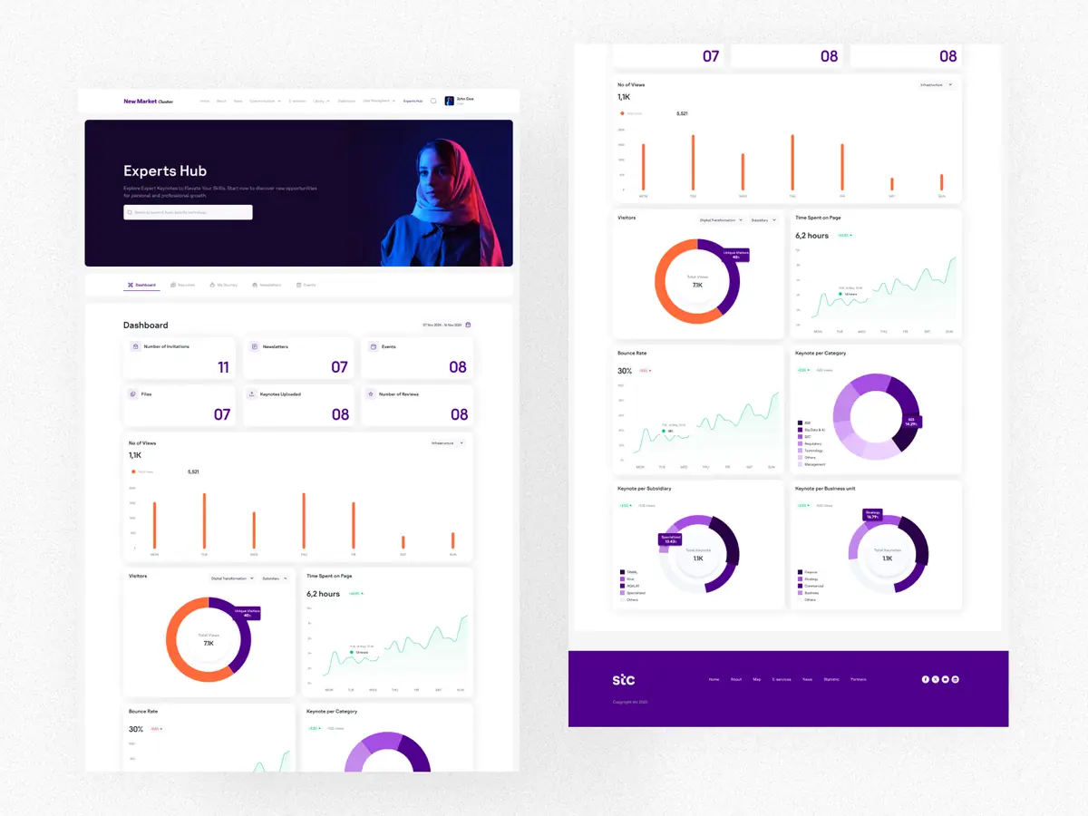
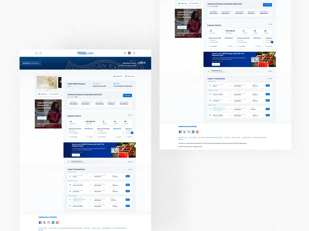
Real products shipped for real teams, including American Express and stc.
Start small with an audit, or go end to end with design and build.
Find what's costing you users, ranked by impact, with redesigned key screens.
From flows to a tested, handoff-ready design for your product or feature.
Design plus front-end and back-end development with my studio's developers.
Not a large one. Most products benefit from a lean system early: tokens and the 15 to 20 components used everywhere. It grows only when the product does.
Yes. I usually start with an audit, keep what works, retire what is duplicated and migrate screens in steps so nothing breaks.
Figma for the system itself, with variables and variants, and documentation your developers can map to code.
Tell me what you're building. I reply within one working day with first thoughts and next steps.