Onboarding loses people
Too many screens before anyone sees why the app matters.
What I doFlows and priorities agreed before design starts.
iOS and Android apps that get people to value fast, keep key actions in thumb reach and feel native on both platforms.
Hover or tap a card to see how I fix it. Most projects start with one of these.
Too many screens before anyone sees why the app matters.
Patterns that ignore iOS and Android habits make the app feel cheap.
Small friction in key flows turns into one-star ratings.
Onboarding should earn each step. Tap through a sample flow and watch the time to first value.
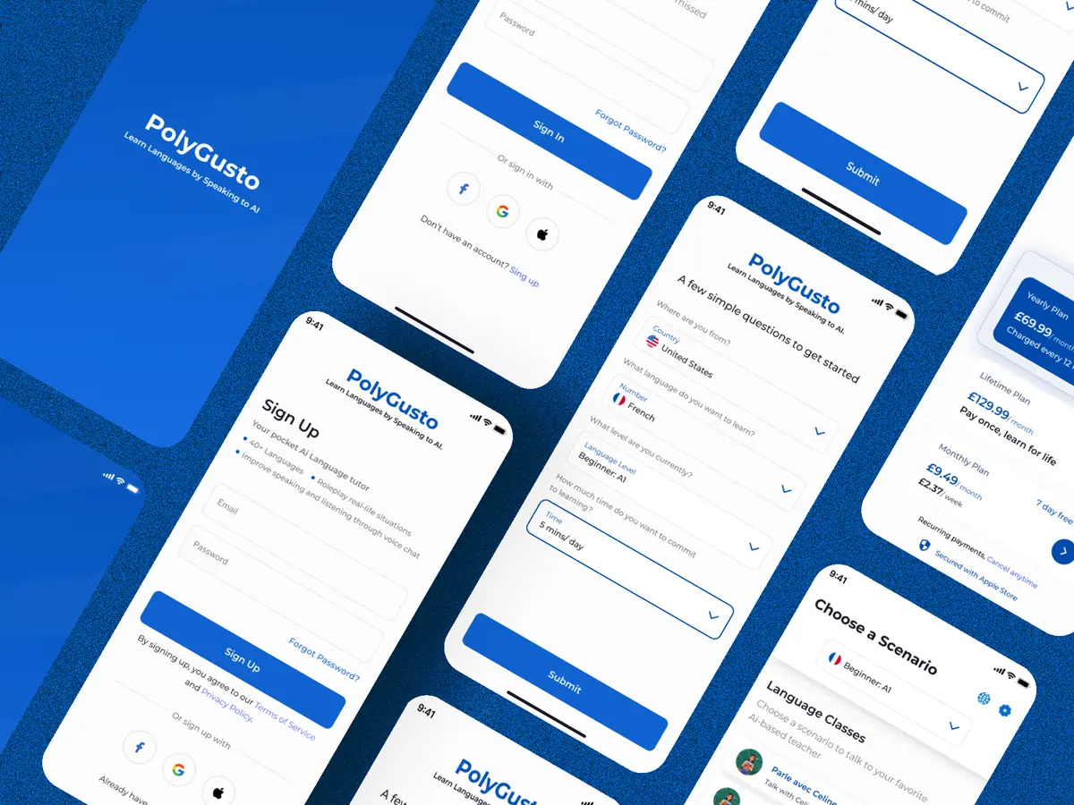
Pick a language and we'll start with a real conversation, not a quiz.
Mobile app UI/UX design from first audit to developer handoff. Pick one to see an example from real work.
A clear plan from day one. You always know what's next and what it costs.
We talk through your product, users and goals. You get a clear scope, timeline and price.
Journeys and structure first, so we agree on how it works before how it looks.
High-fidelity screens and a clickable prototype, refined with your feedback and real users.
Specs and components for your developers, or build and launch with my studio.
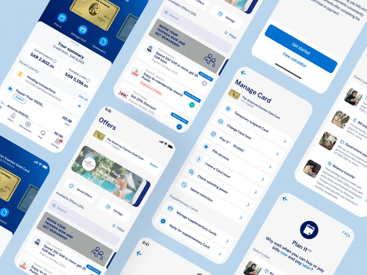
Real products shipped for real teams, including American Express and stc.
Start small with an audit, or go end to end with design and build.
Find what's costing you users, ranked by impact, with redesigned key screens.
From flows to a tested, handoff-ready design for your product or feature.
Design plus front-end and back-end development with my studio's developers.
Yes. I design one product language that respects each platform, so the app feels native on iPhone and Android without doubling the work.
Yes. I start with an audit of your reviews, analytics and key flows, then redesign the parts that cost you users first.
Yes. Through my studio, developer partners can build and launch the app from the same designs.
Tell me what you're building. I reply within one working day with first thoughts and next steps.